Foldable Phone, a New Developer Challenge
A conversation in Jakarta
For more than fifteen years, building an iPhone app came with a comfortable assumption: the screen is a tall rectangle, and it stays that way. Sizes changed a little from model to model, but the shape of the canvas we designed for did not.
That assumption is now gone.
Recently I had the opportunity to meet with the Apple team in Jakarta. We talked about many things, but one topic kept coming back: foldable phones. Apple’s team walked us through the potential they see in this new form factor, and they were just as open about the challenges developers will face in getting their apps ready for it.
I left that meeting convinced of one thing. Foldables are not just a new device to support. They are a new way of thinking about layout, state and user experience, and developers who start early will have a real advantage.
What changed: the iPhone goes foldable
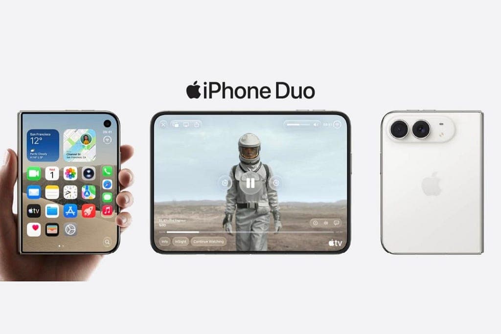
Apple announced its first foldable, the iPhone Duo, on September 9, 2026, and it shipped on October 23 running iOS 27.1. It is a book-style foldable with two displays: a smaller outer screen for quick use when the phone is closed, and a large inner screen when it is opened.
What surprised many developers is the shape of that inner screen. A regular iPhone is tall and narrow, with an aspect ratio of roughly 2.17:1. The inner display of the iPhone Duo is close to 1.42:1, almost like a sheet of A4 paper. For layout purposes it behaves much more like an iPad than an iPhone.
The signs were there months earlier. At WWDC 2026, Apple pushed hard on resizable apps: apps built with the iOS 27 SDK are opted in to resizability by default, and Xcode gained a resizable iOS simulator for testing layouts at any size. Developers also found new references in the iOS 27 frameworks pointing to fold state and hinge angle. In hindsight, Apple was preparing us for this device all year.
The potential
The Apple team was clear that a foldable is not simply “a bigger iPhone”. The opportunity is in experiences that were not possible on a phone before. Some of the ideas we discussed:
- Two-pane layouts on a phone. A list on the left and detail on the right, a chat list beside the conversation, an inbox beside the open email. Patterns we only used on iPad now make sense in a pocket device.
- Productivity on the go. The near-square inner screen fits documents, spreadsheets, dashboards and reading apps very well. For business apps, point-of-sale systems and admin tools, this is a big upgrade in usable space.
- Multitasking. Split View lets two apps run side by side, and apps that support multiple windows can offer much richer workflows.
- Postures as features. The device can be flat, half-folded like a laptop (tabletop), or held open like a book. A video call app can put the video on the top half and controls on the bottom half. A camera app can use the folded phone as its own tripod.
- Continuity between screens. A user can start a task on the outer screen, open the phone, and continue on the large display without losing their place. Done well, this feels magical.
- Early-mover advantage. When a new form factor launches, users actively look for apps that feel made for it. Apps that adapt early get noticed, both by users and by the App Store.
For developers in Indonesia and the region, this is especially interesting. Many of our apps serve business owners who run their operations from a phone. A larger, more flexible screen can turn a phone app into a real working tool.
The challenges
The Apple team was equally honest about what makes this hard. The difficult part is usually not the new APIs. It is the years of layout decisions already sitting inside our apps.
1. The screen size is no longer fixed. An app can move from the small outer screen to the large inner screen, into Split View, and back again, all in one session. Any code that assumes a fixed width, checks the device model, or depends on portrait orientation will break or look wrong. The inner display even ignores the app’s supported orientations, so layouts need to rely on size classes instead.
2. Two different worlds in one device. The outer screen behaves like a compact iPhone. The inner screen reports regular width and regular height, the same as an iPad. One app now needs to look good in both, and switch between them smoothly.
3. State must survive the fold. When the user opens or closes the phone, the app is resized while it is running. A half-filled form, a scroll position, a video in progress or an unsent message must all stay intact. A fold is a UI event with real consequences for the app’s logic, not just its look.
4. Older apps still run, but they waste the screen. Apps built with an older SDK do not crash. They run at their familiar iPhone size inside part of the screen. Nothing breaks, but the experience looks unfinished next to apps that adapt properly. To use the full display, apps need to be rebuilt with the latest SDK.
5. New lifecycle and layout rules. Apps built with the iOS 27 SDK must adopt the scene-based lifecycle. The camera area sits in a different position, so safe-area insets are no longer symmetric on both sides. These are small details that can cause clipped buttons and broken toolbars if they are ignored.
6. Hardware assumptions. The iPhone Duo uses Touch ID rather than Face ID. Any app that hardcodes “Face ID” text or icons in its login flow will look wrong.
7. Testing becomes much bigger. One screen size used to be enough for a quick check. Now every release needs to be tested on the outer screen, the inner screen in both orientations, Split View, and the transitions between them. Apple has also said that iPhone Duo screenshots will be required in App Store Connect starting April 2027, so this work has a deadline.
8. Fewer devices to test on, for now. Like every new form factor, the device is premium and not yet in every developer’s hands. Much of the early work will rely on the simulator, which makes careful layout design even more important.
A practical checklist
If you maintain an iOS app today, here is where I would start:
- Build with the latest Xcode and iOS SDK so the app can use the whole display.
- Remove hardcoded sizes. Replace checks on screen bounds, device model and orientation with size classes and adaptive layouts (Auto Layout or SwiftUI).
- Adopt the scene lifecycle if your app still uses the old app delegate approach.
- Design a real two-pane layout for the large screen instead of stretching the phone layout.
- Save and restore state on every size change, and test opening and closing the device in the middle of real tasks.
- Respect safe areas and do not assume left and right insets are the same.
- Check biometric wording so your login flow says Touch ID or Face ID correctly.
- Test with the resizable simulator at the outer size, the inner size in both orientations, and in Split View.
- Prepare App Store assets for the new device before screenshots become mandatory.
- Avoid device-specific branches. The best foldable apps contain very little code that knows about the foldable. They are simply well-built adaptive apps.
Closing thoughts
Android developers have been working with foldables for years, and now iOS developers are joining them. For our community in Indonesia, this is a chance to be early rather than catch up later.
My biggest takeaway from the conversation with Apple’s team in Jakarta is simple: the foldable is a test of how well our apps are built. Apps with clean, adaptive layouts and careful state handling will shine almost for free. Apps full of shortcuts and hardcoded sizes will show their age immediately.
The challenge is real, but so is the opportunity. The screen has changed shape. It is time our apps did too.
Facing a similar challenge?
We would be glad to help your business find the right solution.
Start a project